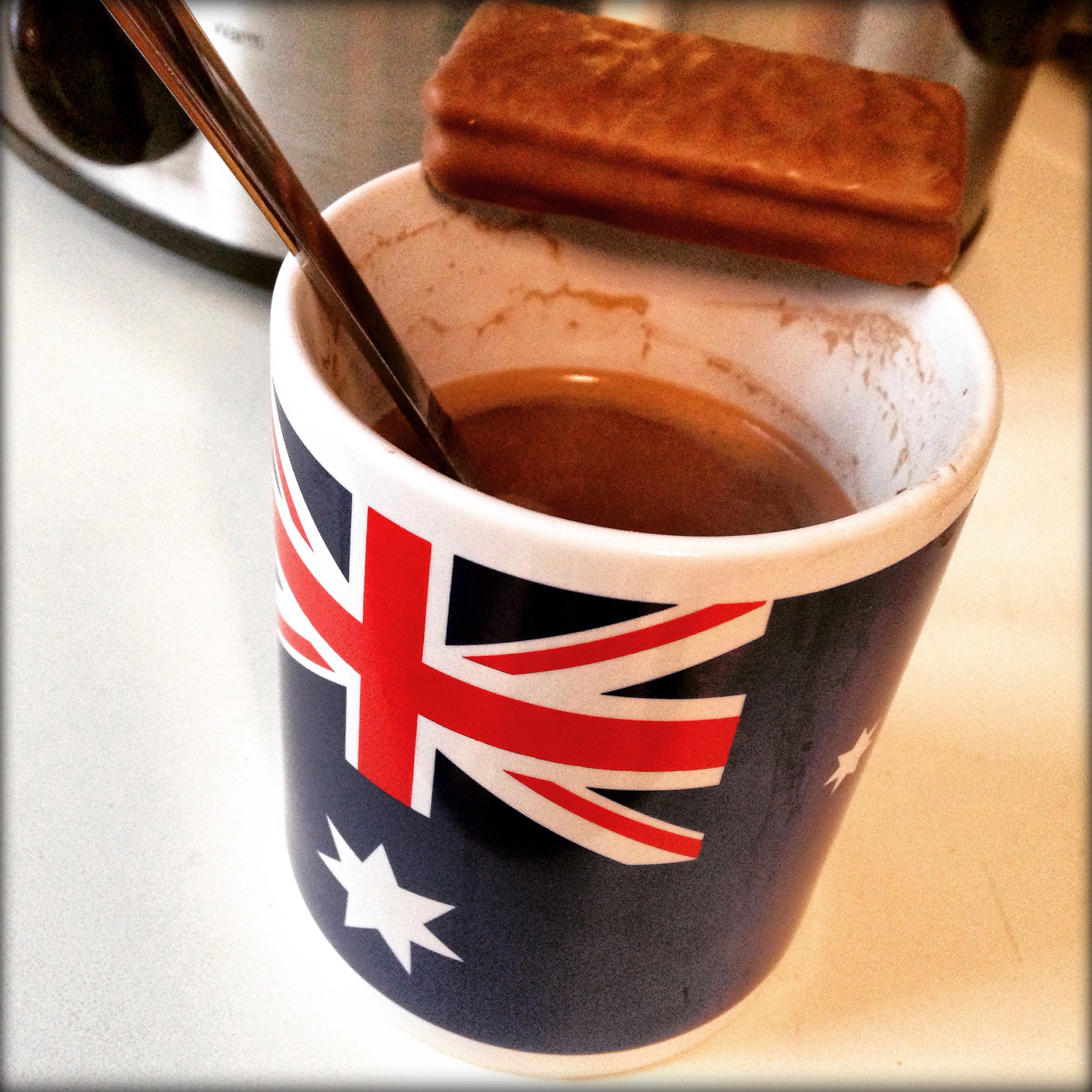
Just another regular February day in #Michigan. http://t.co/eH4XUriMIJ
— Jere Freeman (@Jere_Freeman) February 15, 2015

Just another regular February day in #Michigan. http://t.co/eH4XUriMIJ
— Jere Freeman (@Jere_Freeman) February 15, 2015
I spent the afternoon doing to more cleaning up and organizing/reorganizing of the site. What I worked on today was categories and tags. In the past they’ve been basically the same thing, and for the past year or so, I’ve just been tagging and categorizing all my posts with the same thing. It has always seemed redundant to me, but I never got around to fixing it, until today.
So here’s the changes. Categories are the main topics that we cover here. I whittled it down to 4, Family, Browsing, Ramblings, and Uncategorized. Family basically is any family news, experiences, family history, travels, and such. Browsing are interesting things we share with each other that we’ve come across on the web. Ramblings are for almost everything else, opinions we write, reviews we write, sports talk, movies we’ve seen, that kind of thing.
Don’t worry, you don’t have to categorize your posts, and if you don’t, WordPress will automatically put it into the Uncategorized category. I’ll occasionally go through these and put them where they I think they should go.
Categories that used to be there that seem gone were just changed to tags. No posts were lost. Tags are the other items I wanted to talk about. Most of you probably already know how tags work, and they work here the same way. Basically, use tags to kind of describe what the post includes or is about. It is more specific than the category. The pictures category I changed to Photos tag. The music and videos categories were changed to Music and Videos tags.
You don’t have to use categories or tags if you don’t want to. The advantage is you can search and sort by either of them. Want to see just all our Family posts? Just look at the Family category. Want to see all the posts that contain photos? Look at the Photos tag. If you want to see just Family posts that include Photos you can do that too.
Again, hit me up with any questions or thoughts.
I’ve been wanting to update the site for a while now but just haven’t got around to it. When the latest version of WordPress (the software the site is built on) came out, it included their new theme for 2015.
The theme was built with a lot of flexibility as to the different size screens and devices that could be used to view the site. I thought it was a design I could use as a foundation for a visual update so here it is.
I didn’t have to do any coding this time, just change some settings already built into the theme and add the graphics. The site should now look good whether your viewing it on a small phone screen, a tablet, or on a large computer display.
So far I like how it’s turned out and it’s still very true to our old design. I took this opportunity to also clean up a bunch of links. If you notice something that used to be there that you want back, let me know.
I’m actually using my iPhone to post this and it’s as easy as if I were on a computer.
Finally, I know there are a lot of posts from Twitter, Instagram, etc. I include these because Mom says she likes them, she can keep up with our social media interactions (pictures especially) without having to actually be on social media. If you want help posting something of yours in a similar fashion just let me know.

About to knock down a #TimTamSlam. Thanks beckstergirl33 for bringing this home from #Australia. http://t.co/0E2976V93A
— Jere Freeman (@Jere_Freeman) February 2, 2015
Becky & I are trying new things for the #SuperBowl, #pizzamonkeybread in the oven, #pulledpork in the crockpot. pic.twitter.com/KFgJbBm7Rl
— Jere Freeman (@Jere_Freeman) February 1, 2015
So lucky I've spent half this beautiful woman's life with her. #HappyBirthday sweetheart!
http://t.co/eWanKdsO2m pic.twitter.com/u5jjCtQvZm
— Jere Freeman (@Jere_Freeman) January 28, 2015